Penguin Infographic
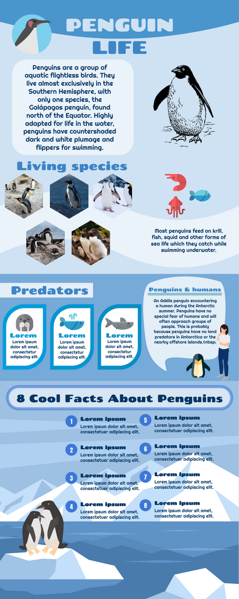
You know what makes penguins so special and interesting? Penguins are some of the world’s most famous and beloved birds, and even have their very own holiday – World Penguin Day on April 25. Penguins are also some of the most unique and amazing birds due to their physical adaptations to survive in unusual climatic conditions and mainly live at sea. Threats to Penguins There are 18 unique penguin species in the world, although two species – the northern rock and fish and the southern rock are fish – are sometimes considered to…continue reading →