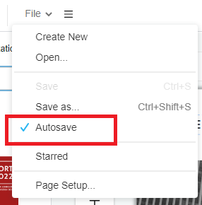
How to Enable Autosave?
From time to time, accidents happen during our work such as browser crashes or even your laptop run out of battery and that is why InfoART has "AUTOSAVE" function. By enabling the "AUTOSAVE" function your work will be save automatically in no time, without having to worry anything about losing any progress even accident happens! This guide will show you the steps to enable such function that will make your workflow smooth. The steps is as follow: Click on the menu bar of the top of the canva Hover over File and click…continue reading →