Find Out Similar Animated Elements

Find Out Similar Animated Elements

When creating animated flipbook, instead of adding animation effects to different text and images, we can also choose to add animated shapes. There are now 1000+ pre-made animated shapes in the library of VP Online. In this article, you can know how to find out similar animated elements that fit your needs. https://www.youtube.com/watch?v=9ZY8JiswpHE&width=854&height=480 Category and Keywords All animates shapes have category and keywords, which can help us to search the animated shapes we need and find similar elements easily. You can find them by clicking the "..." on the top right corner of…continue reading →
How to add a chart title?

How to add a chart title?

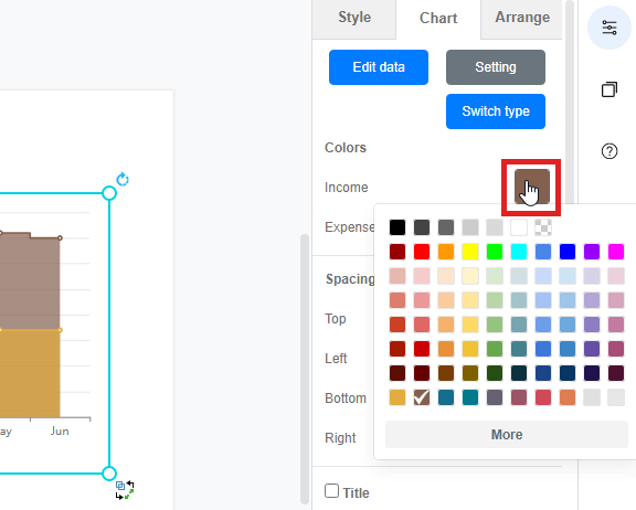
Visual Paradigm Online provides you with an online design tool for everyone to use. In Visual Paradigm Online, you can create various charts freely like bar charts, column charts, pie charts, etc. This chart tool can help you to display any data by using text, symbols, and graphics. You can easily visualize the data that you have collected as graphics and they are presentable. You can also edit the chart easily with the data, chart titles, chart colors, fonts, etc... This is a guide for teaching you to add chart titles on chart…continue reading →
How to Create a Nightingale Rose Chart

How to Create a Nightingale Rose Chart

In Visual Paradigm Online, you can easily create graphics with the online design tool for free. Sometimes, we need to record data for a particular use and sometimes we may need to present the data through graphics. In Visual Paradigm Online, you can create various charts freely like bar charts, column charts, pie charts, etc. This chart tool can help you to display any data by using text, symbols, and graphics. You can easily visualize the data that you have collected as graphics and they are presentable. This is a guide for teaching…continue reading →
How to Bring a Shape to Front in your Design

How to Bring a Shape to Front in your Design

Having many elements on your design can be confusing to manage. This tutorial will show you how to arrange elements above or below each other to create the best design. Watch it now and feel free to create your own design at VP online.
How to Create a Curved Line Chart

How to Create a Curved Line Chart

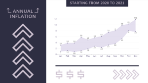
The formal expression used to describe a linear graph is linear whether it passes through the origin or not, and the relationship between the two variables is called linear. Similarly, the relationship shown by a curve graph is called non-linear. A curved line chart will indicate change. In this video, you can see how to create a curved line chart in VP Online.
How to Replicate a Shape in Forming a Pattern

How to Replicate a Shape in Forming a Pattern

Often when you see a cute graphic, you might want to create a pattern background with the elements which can be done easily easily with Visual Paradigm Online. In this video, you can see how to replicate a shape in forming a pattern in your design.
How to create a butterfly chart?

How to create a butterfly chart?

A butterfly chart is a type of bar chart used to compare two sets of data simultaneously. This type of chart represents the data as two horizontal bars with the same x-axis in the middle, which is useful when comparing two sets of data for comparison purposes. Create charts easily with Visual Paradigm Online. In this video, you can see how to create a butterfly chart in VP Online. 
How to Use the ‘Find and Replace’ Function

How to Use the ‘Find and Replace’ Function

When you are diagram with many items, you might have difficulties in changing mass amount if item names. Here's why we have "find and replace" function so that you can change the names at once.
How to ‘Bookmark’ a Design

How to ‘Bookmark’ a Design

Adding a "bookmark" to your design is a good way to mark them, you can then use the function "Show Starred Only" to pick them out easily! This video will show you the flow of it.
Change Symbols of Line Chart

Change Symbols of Line Chart

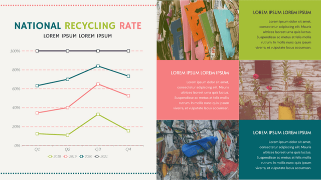
When creating line chart, we can do lots of customization on it, including the color, lines, size, etc. Moreover, we can change the symbol of the chart. This article will show you how to do it. https://www.youtube.com/watch?v=LDoLN6i8vd8&width=854&height=480 How To Change Symbols of Line Chart After selecting a line chart, go to Panel-Chart, we can see a part called Line. Under it, there is 3 sections: Symbol (shape of the symbol) Symbol Size Line Width We can find various choices under the symbol, choose the one mostly fit your design. You can then control…continue reading →