Move a group of shapes with the sweeper and magnet tool

Move a group of shapes with the sweeper and magnet tool

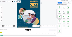
Your design is almost finished and now it'll be perfect if you could move everything over towards the left just a little bit. Our graphic design tool has features such as the Magnet and Sweeper tool. You can move all the objects at once without selecting anything. Magnet tool will pull objects closer, while sweeper will push objects further apart. This video will show you how to move a group of shapes with the sweeper and magnet tool. https://www.youtube.com/watch?v=DPjDKaNvJCw&width=854&height=480 When editing your design, you can make some space, or reduce space within the…continue reading →
Restore your Unsaved Works

Restore your Unsaved Works

Visual Paradigm Online automatically saves your work as you edit it. Auto-save saves the project currently open from time to time on its own. It helps to avoid losing project data when your machine crashes between saves or hits a power outage suddenly. This video will show you how to restore your unsaved works in Visual Paradigm Online. https://www.youtube.com/watch?v=M6nnp-BgmL8&width=854&height=480 In VP Online, you can restore your unsaved works, in case you previously missed saving them, for example, a computer crashed. In the dashboard, simply go to My Documents, unsaved works, to show the…continue reading →
How To Create A 100% Stacked Line Chart

How To Create A 100% Stacked Line Chart

What Is A 100% Stacked Line Chart A 100% stacked line chart is a stacked line chart without any overlapping, as the lines are representing the summarize of data in different level. Each of the points represent the percentages of the data within 100%., while the top line should be a strange line as all of them are in 100%. When To Use 100% Stacked Line Chart When we are having different data column, and we want to add them together and shown the total trend of them, 100 stacked line chart will…continue reading →
Create a range area chart

Create a range area chart

A range area chart type of data visualization is primarily used to display both high and low values for a given time period. The x-axis usually represents the time scale to show how the data changes over time. This video will show you how to create a range area chart in Visual Paradigm Online. https://www.youtube.com/watch?v=Ihnyc7HoTFU&width=854&height=480 What is a range area chart? A range area chart displays information as a range of data by plotting two Y values (low and high) for each data point. It looks like two lines, and the area between…continue reading →
How to create a radial chart?

How to create a radial chart?

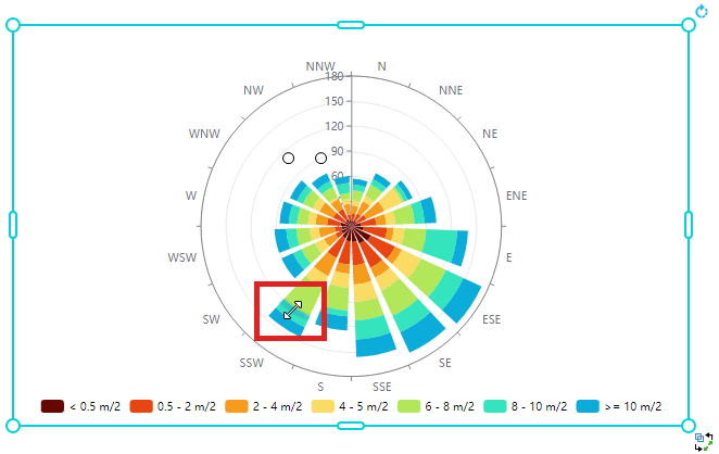
A radar chart is a graphical method of displaying multivariate data in the form of a two-dimensional chart of three or more quantitative variables represented on axes starting from the same point. This video will show you how to create a radial chart in Visual Paradigm Online. https://www.youtube.com/watch?v=xyD5PkHtjfE&width=854&height=480 What is a radial chart? A radar chart is a graphical method of displaying multivariate data in the form of a two-dimensional chart of three or more quantitative variables represented on axes starting from the same point. The relative position and angle of the axes…continue reading →
How To Create A Doughnut Chart

How To Create A Doughnut Chart

What Is A Doughnut Chart Doughnut chart shows the amount of the data by the percentage of the parts, which is very close to a pie chart. Moreover, we can add more rings on the chart to fit our needs if there are more than one series of data, such as a double doughnut chart. When To Use Doughnut Chart As doughnut chart is used to present the relationship between the part and the whole, it is commonly used when we want to compare the percentages of different parts, and also the case…continue reading →
How to create a stepped area chart?

How to create a stepped area chart?

We often record data for a particular use and sometimes we may need to present the data through graphics. In Visual Paradigm Online, you can create various charts freely like bar charts, column charts, pie charts, etc. This chart tool can help you to display any data by using text, symbols, and graphics. You can easily visualize the data that you have collected as graphics and they are presentable. This is a guide for teaching you to create a stepped area chart with Visual Paradigm Online. You can watch the attached video or…continue reading →
How to Create a Range Spline Area Chart

How to Create a Range Spline Area Chart

Range splines are very similar to area plots for data visualization. The main difference between them is that the second graph plots the values of the Y axis one by one, while the first is a type graph of the spline area that plots the values of both Y axes over time - low and high. Create charts easily with Visual Paradigm Online. In this video, you can see how to create a range spline area chart in VP Online.
Show Values On Bar Charts/ Column Charts

Show Values On Bar Charts/ Column Charts

In bar charts and column charts, the length of the bars are changed according to the value. Although we can read the value by the split lines, we sometimes may not get the exact number, while extra time is also needed. In this case, we may choose to show the values on the chart directly. How To Show Values On Bar Charts https://www.youtube.com/watch?v=JUcNMfi2Sc8&width=854&height=480 Under Panel-Chart, there is a option Label. Click it and you will finds that there are numbers on the top of each of the bars. Moreover, we can customize the style…continue reading →
Link chart data with Google Sheet

Link chart data with Google Sheet

Visual Paradigm support visualizing your data into various charts. This feature gives you valuable insights to your data. The data can be visualized by entering with the build-in spreadsheet tool, uploading of Excel file, or directly linking from Google Sheets. In this article, we will show you how to feed data to your chart by link to Google Sheets. https://www.youtube.com/watch?v=bk44-JOvjpc&width=854&height=480 You can create any chart and link the chart data with Google Sheet when using the Visual Paradigm Online. In Google Sheets, you can go to "Share", and press the "Copy Link" button…continue reading →