How to create a 360 punch card?

How to create a 360 punch card?

In Visual Paradigm Online, you can easily create graphics with the online design tool for free. Sometimes, we need to record data for a particular use and sometimes we may need to present the data through graphics. With the design tool in Visual Paradigm Online, you can create various charts freely like bar charts, column charts, pie charts, etc. This chart tool can help you to display any data by using text, symbols, and graphics. You can easily visualize the data that you have collected as graphics. This is a guide for teaching…continue reading →
How to create a map?

How to create a map?

In Visual Paradigm Online, you can easily create graphics with the online design tool for free. Sometimes, we need to record data for a particular use and sometimes we may need to present the data through graphics. With the design tool in Visual Paradigm Online, you can create various charts freely like bar charts, column charts, pie charts, etc. This chart tool can help you to display any data by using text, symbols, and graphics. You can easily visualize the data that you have collected as graphics. This is a guide for teaching…continue reading →
How to Create a Simple Gantt Chart

How to Create a Simple Gantt Chart

Gantt charts help teams to plan work around deadlines and properly allocate resources. Turn your raw data into beautiful charts with our online Gantt chart maker. Visual Paradigm Online features a rich collection of chart types and chart templates. Create your chart easily and quickly now!
Create a stacked column and line chart

Create a stacked column and line chart

A stacked column and line chart is a combination of a Line Chart and a vertical Stacked Bar chart. This video will show you how to create a stacked column and line chart in Visual Paradigm Online. https://www.youtube.com/watch?v=ir8vhCsumW4&width=854&height=480 What is a stacked column and line chart? A stacked column and line chart is a combination of a Line Chart and a vertical Stacked Bar chart. A stacked column and line chart is similar to a Grouped Bar with Line Chart—the only difference is that in a standard Grouped Bar with Line chart, each…continue reading →
Hide the legend of a chart

Hide the legend of a chart

Visual Paradigm Online can help you make beautiful charts online with a free chart maker. Create charts with custom styles in minutes. This video will show you how to hide the legend of a chart in Visual Paradigm Online. https://www.youtube.com/watch?v=Ca3DTYlBxsk&width=854&height=480 Visual Paradigm Online makes it simple to enter in your information and turn it into a stunning chart. You can also easily customize your chart to match your company's brand colors and fonts or choose the color that matches your topic. Customize everything, from the fonts and colors to the position of titles…continue reading →
How to create a pictorial chart?

How to create a pictorial chart?

Sometimes, we need to record data for a particular use and sometimes we may need to present the data through graphics. With the design tool in Visual Paradigm Online, you can create various charts freely like bar charts, column charts, pie charts, etc. This chart tool can help you to display any data by using text, symbols, and graphics. You can easily visualize the data that you have collected as graphics. This is a guide for teaching you to create a 360 punch card with Visual Paradigm Online. You can watch the attached…continue reading →
How to create gauge chart?

How to create gauge chart?

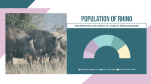
You can easily create graphics in Visual Paradigm Online for free. Sometimes, we need to record data for a particular use and sometimes we may need to present the data through graphics. With the design tool in Visual Paradigm Online, you can create various charts freely like bar charts, column charts, pie charts, etc. This chart tool can help you to display any data by using text, symbols, and graphics. You can easily visualize the data that you have collected as graphics. This is a guide for teaching you to create a gauge…continue reading →
How to open an earlier version of a design?

How to open or restore an earlier version of a design?

In Visual Paradigm Online, you can create your own design work and save your work in your working space. Our tool can automatically save your design history after you clicked on the Save button in the editor. It can help you record your design history. You can freely preview the design history and open any earlier versions that you have saved in Visual Paradigm Online. With this tool, you can easily go back to the previous design processes of your work. This is a quick tutorial for you to open an earlier version…continue reading →
Create a stacked column chart

Create a stacked column chart

Stacked column charts are a basic Excel chart type that allows comparisons between parts and wholes at different times or in different categories. In a stacked column chart, data series are stacked one on top of the other in vertical columns. This video will show you how to create a stacked column chart in Visual Paradigm Online. https://www.youtube.com/watch?v=eg9kTP9mXi8&width=854&height=480 What is a stacked column chart? A stacked column chart consists of several vertically stacked series of columns, one after the other. The length of each series is determined by the value in each data…continue reading →
Create a stacked radial chart

Create a stacked radial chart

A stacked radial chart can enable you to plot the categorized series on a polar coordinate system. The Y-axis is in a circular manner, like a radar chart making the columns circular. This video will show you how to create a stacked radial chart in Visual Paradigm Online. https://www.youtube.com/watch?v=6mmvD5gYsmE&width=854&height=480 What is a stacked radial chart? A stacked radial chart is a bar chart displayed on a polar coordinate system. The difference between radial column charts is that the base axis of the series is the y-axis of a radar chart making columns circular.…continue reading →